This is the first of a series of posts on Automotive (and similar) applications for real-time engines such as Unity. In this part, I’ll go over the basics of HDRP in 2019.1, some rendering tricks, colour grading and points of interest to do with advertising.
First of all, the most interesting change to 2019.1’s HDRP is the move to Volumes for EVERYTHING. All the skybox, ambient lighting and fog information is now in-scene, in a volume profile. Very useful! Personally I’m using 2 volume profiles ‘per-area’. One for environment; lighting, fog, SSAO, SSR, etc. One for post-processing; colour grading, vignetting, etc. You could also use a third for Bloom, Chromatic Aberration, Exposure, and other Camera-Based effects, but I fold them into the other two fairly easily. Some notes here: you should always use the new Panini Projection effect. Always. It’s great, like a more natural fisheye effect, makes the image look a lot better as the FoV creeps up. And always have a SSR panel set up for custom settings, since the default ones are rubbish.

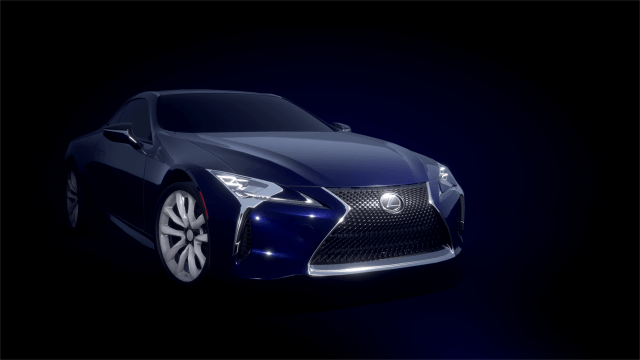
The star for this post is the Lexus LC500. It’s a modern, stylish luxury coupe and while the 3d model isn’t top notch it’ll serve for now. As a premium brand, the paint options available are great to work with; pearlescent white, metallic finishes, bold colours, and some varied materials such as chrome, plastics, glass, and fantastic lighting elements.
For advertising, special editions (like the Zinnia Yellow LC 500, below) are a major point to consider. Often these are premium versions, with extra equipment, and at a higher price point, so manufacturers will want to add extra emphasis and differentiation over the regular model. These can be more likely used in print (opposed to digital) media, and there’s tricks to taking advantage of that. For example, take the vertical image (below, top-right). Lexus, a top-tier brand, is likely to pay more for a better ad position; ideally a full-page on the right side. To reflect that, the lighting in the scene is biased to be from the right hand side as well; the side of the page ‘open’ to the viewer, while the darker side is towards the spine/seam.
Rendering for web use offers its own set of tricks. Some of them are just plain simple – a monochromatic image will take up much less bandwidth for a given resolution. Or for a given resolution, offer much higher image quality. And by using a high-contrast image, it becomes easier to view in the wide range of lighting conditions mobile users are likely to encounter.


One increasingly-common part of rendering cars is dealing with pearl-effect paints. These are highly view-dependent, and the more subtle effects get lost very easily. Considering that the distance between the eyes, and the proximity of the light, it’s strange to think that the colour will not ‘resolve’ for a point on the car. Each eye will see a slightly different hue/brightness. My solution is to have a slight offset, in view space, of red, green and blue lighting components, no more than a few degrees. This gives the pearl some ‘pop’ back; in the image below notice the tinted highlights near the headlight, and colour fade toward the windscreen. Technically this isn’t 100% physically correct, but it’s fast, simple, and gives that slight strangeness back to pearlescent colours.

Finally, one of the more unorthodox uses is creating stylized or non-photo-realistic (NPR) images. Typically these are high-contrast, low-colour-depth pictures that mimic some existing medium (water-colour, stencil/print, etc). You can build these fairly easily, with existing filters in Photoshop or Gimp, whatever has layers and blending options.
You can also create these in Unity. With HDRP and access to a Main Camera outputting to a render-texture, you use that as input to a Shader Graph Editor (SGE) graph. From there, you can sample that multiple times, blend layers, apply masks, filters, etc and output that to a fullscreen quad. The ‘blend’ node in SGE is your friend.


